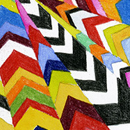
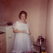
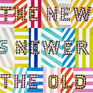
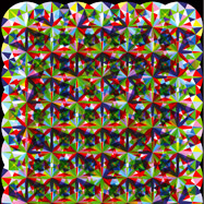
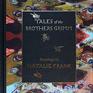
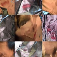
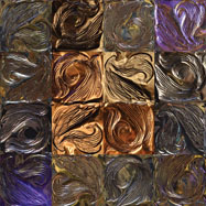
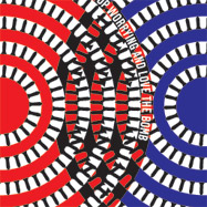
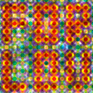
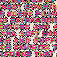
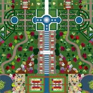
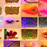
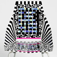
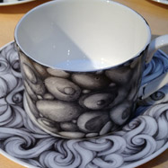
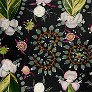
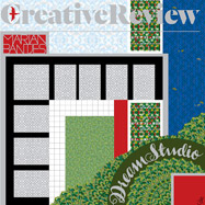
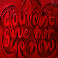
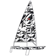
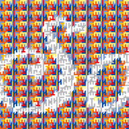
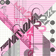
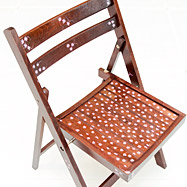
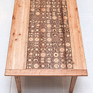
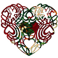
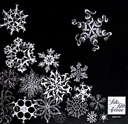
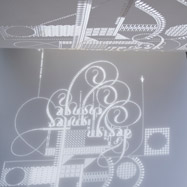
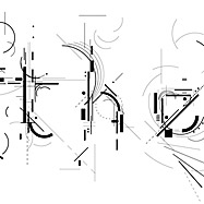
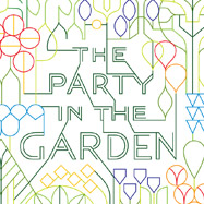
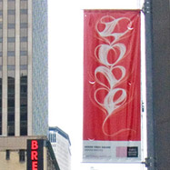
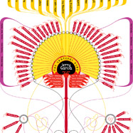
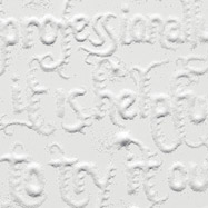
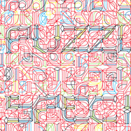
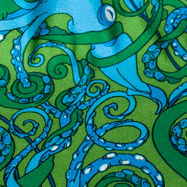
This is a selection of my recent and best work from the past. All of my work from 2003–2013 is documented in my monograph, Pretty Pictures.
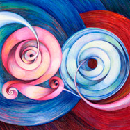
This is a selection of my recent and best work from the past. All of my work from 2003–2013 is documented in my monograph, Pretty Pictures.