Design Ignites Change
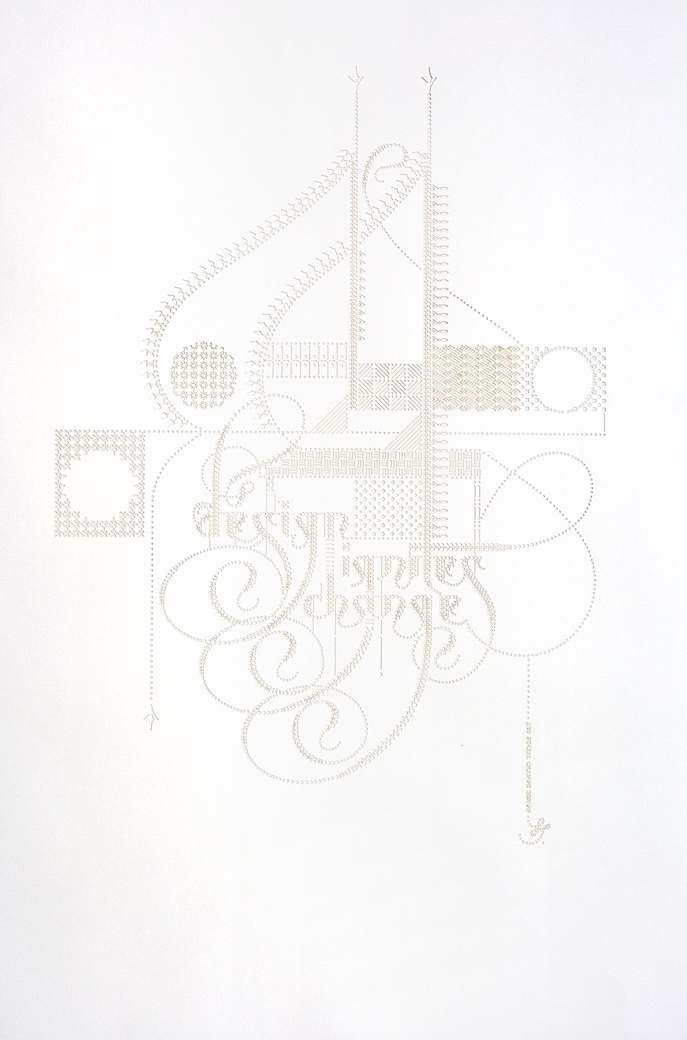
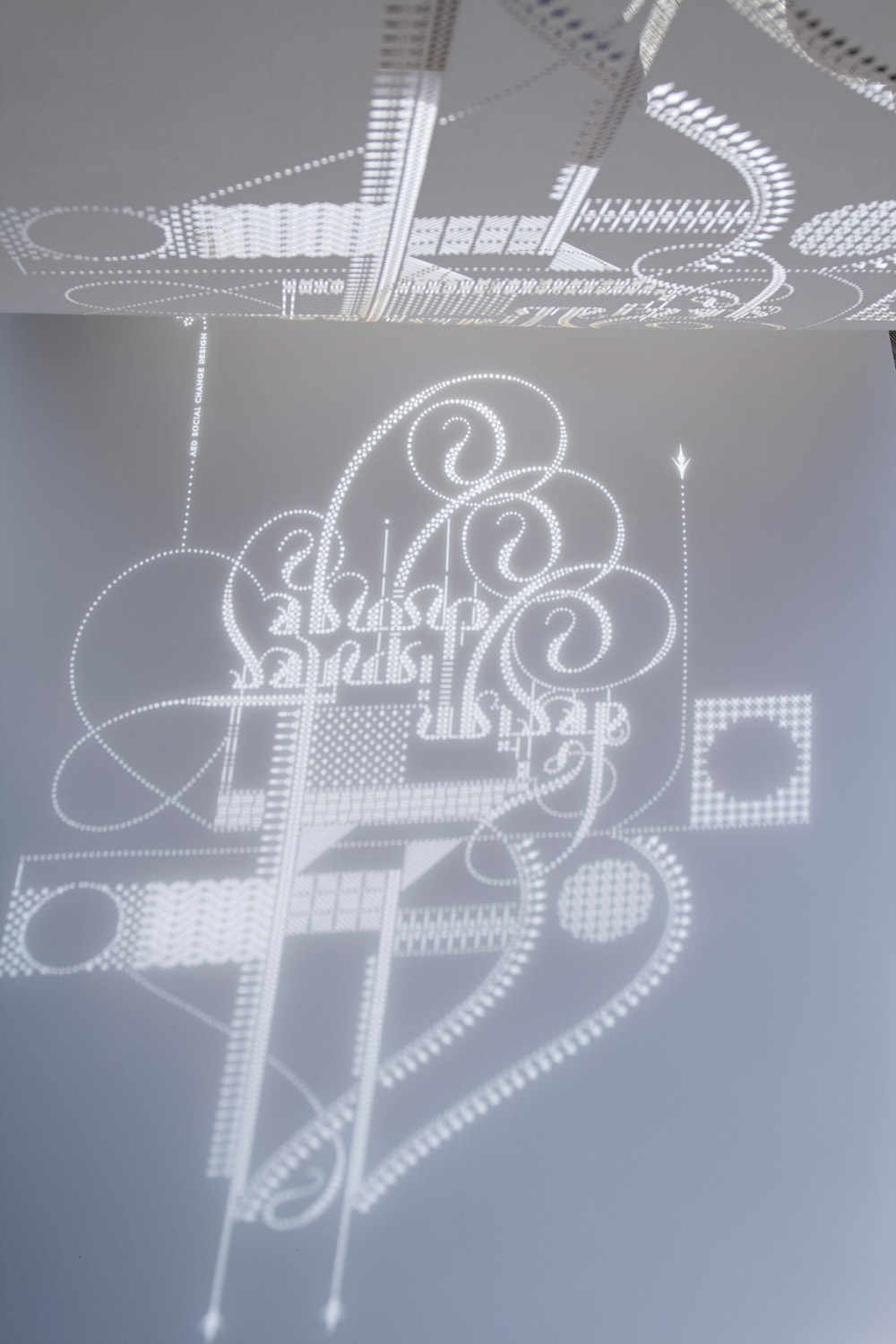
This poster is for the design unit within the Academy for Educational Development, a DC-based international non-profit. It says “Design Ignites Change” and is part of a series of posters that they do to promote the importance of design in development work. This version of the poster, of which there are only 150 copies (they have 100, I have 50), has no printing, but is laser cut from white paper. Above shows it in white on white, below shows it hung on a glass door.
It also casts a beautiful light shadow.
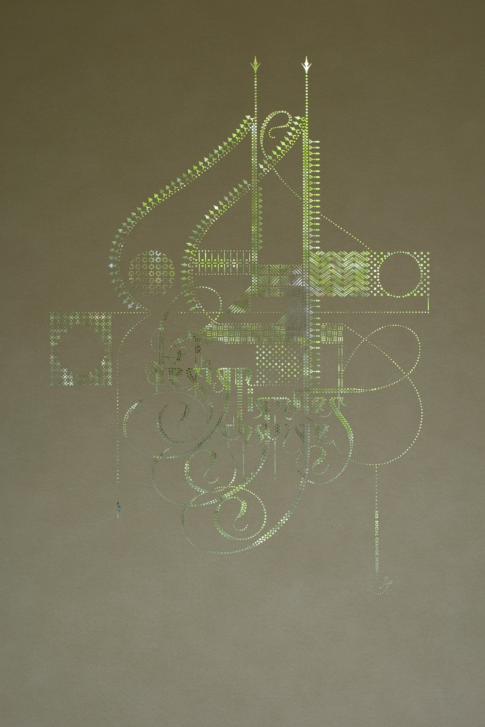
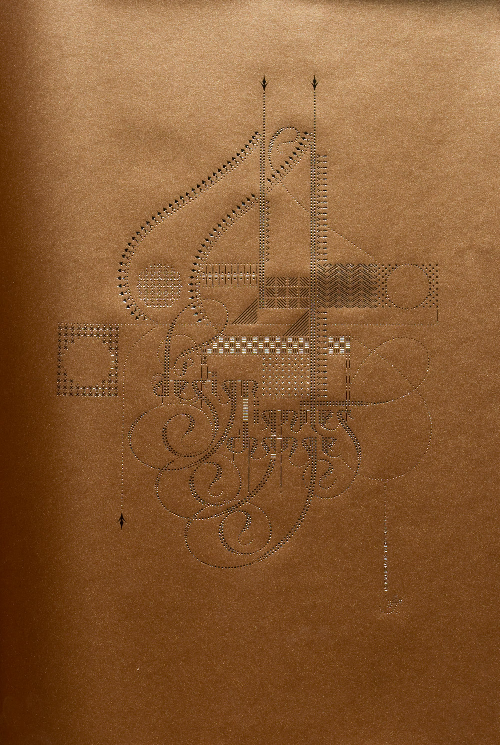
They sold out this poster in the first 2 days, so then we made a second version: same design but this time in silver foil on copper paper. The proceeds went to benefit AED’s Speak for the Child project, which provides assistance to children orphaned by HIV/AIDS in Kenya.
2008